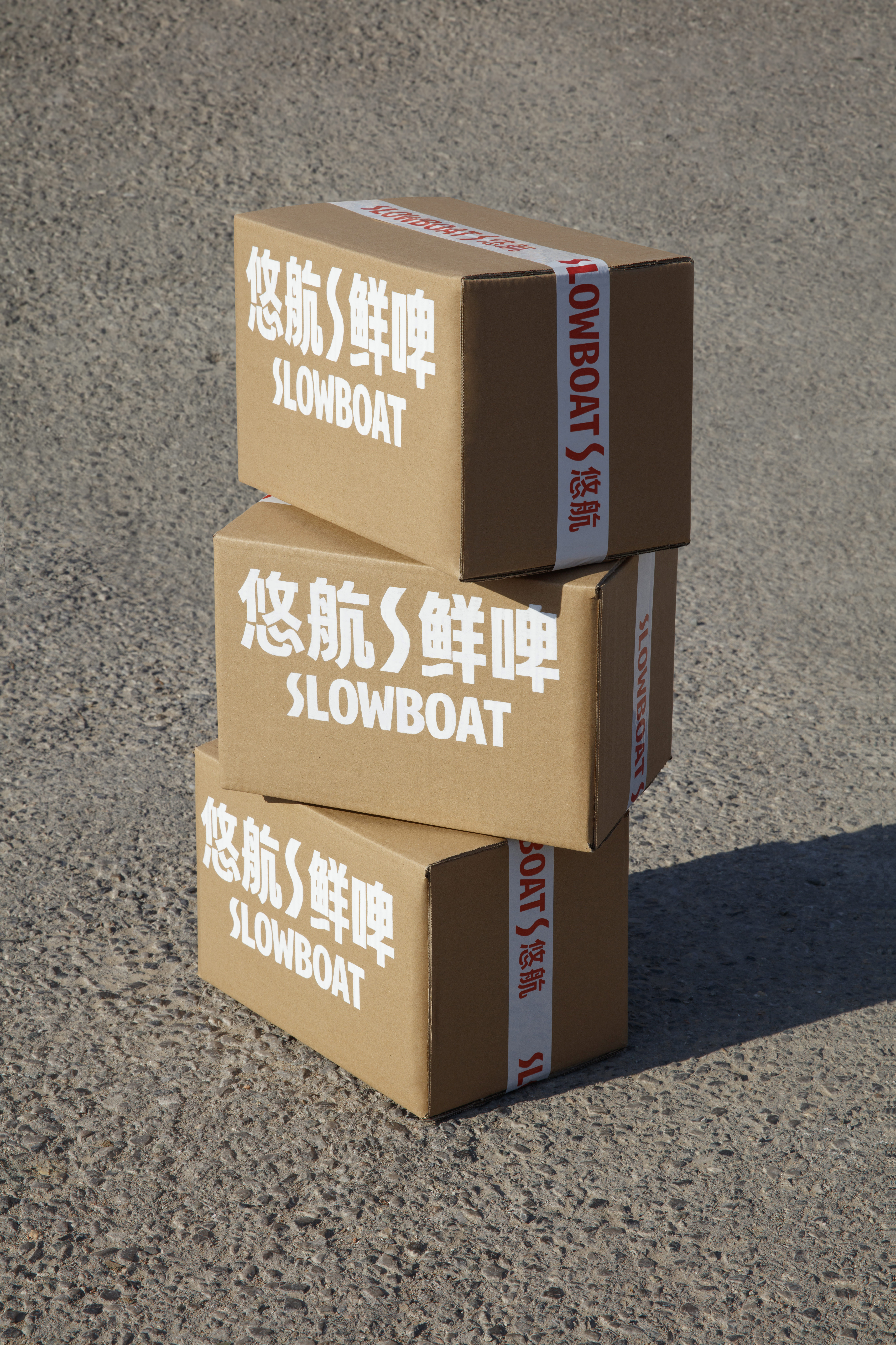
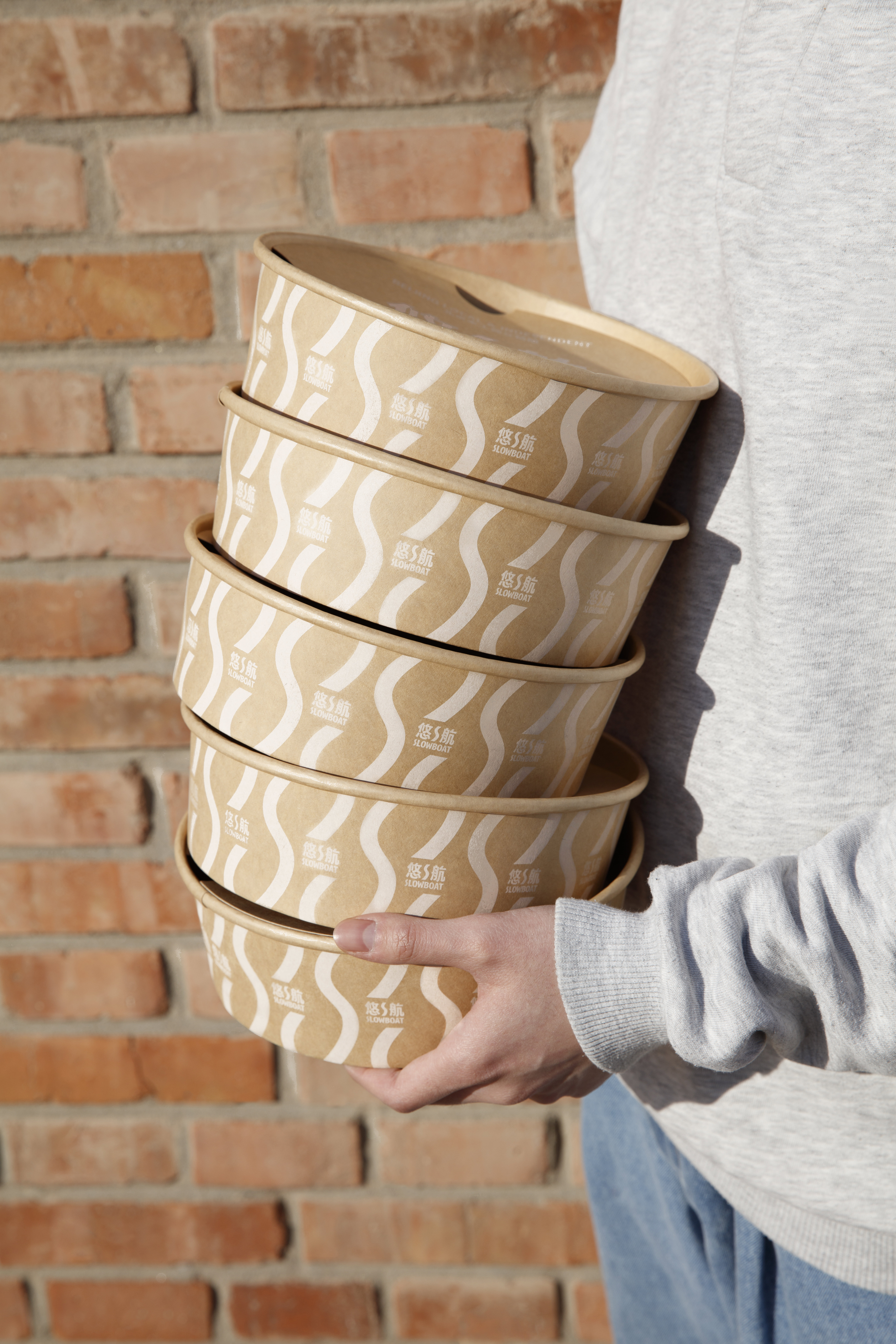
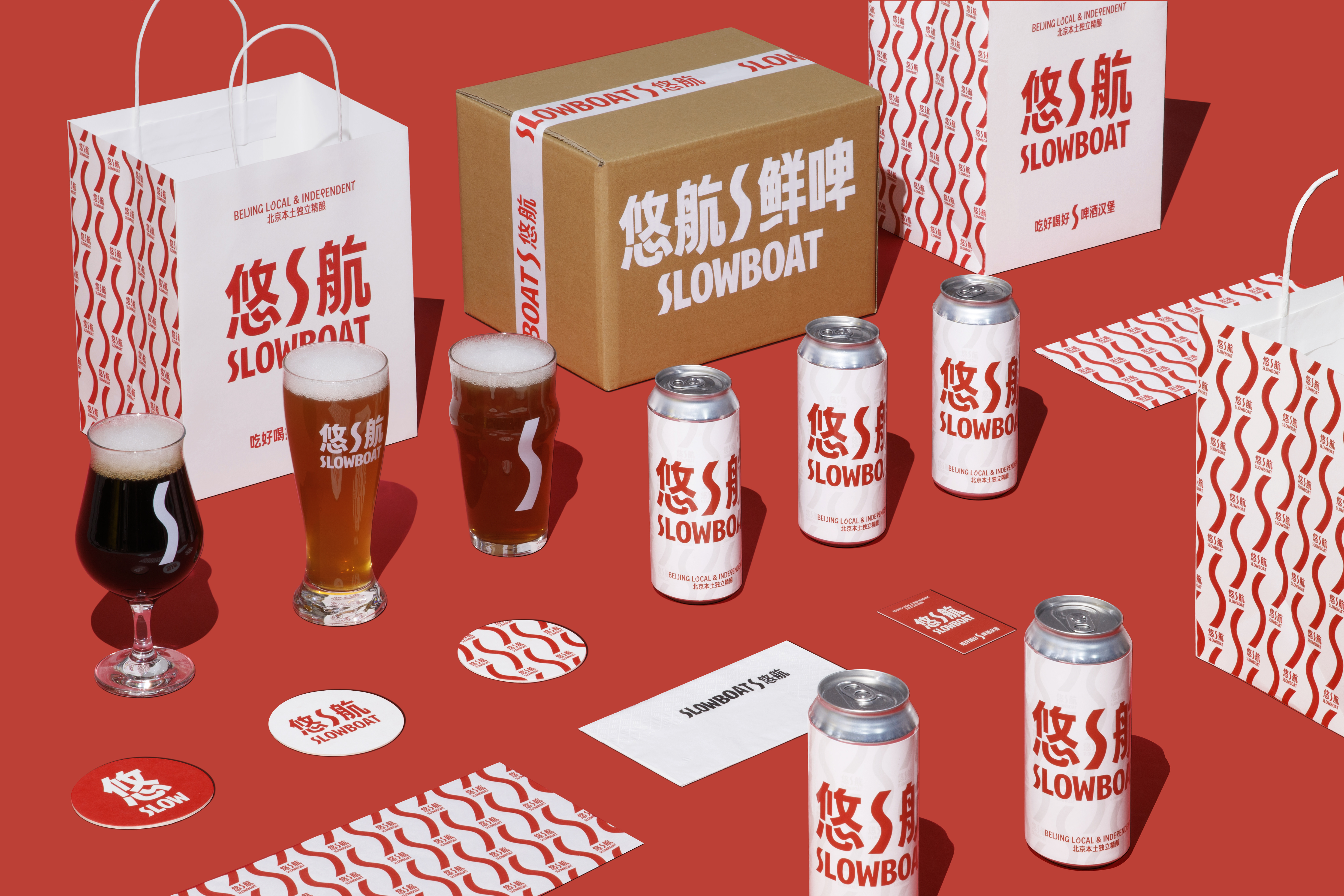
SLOWBOAT is a casual feeling when you enjoy a good time with friends, family, loved ones, or yourself.
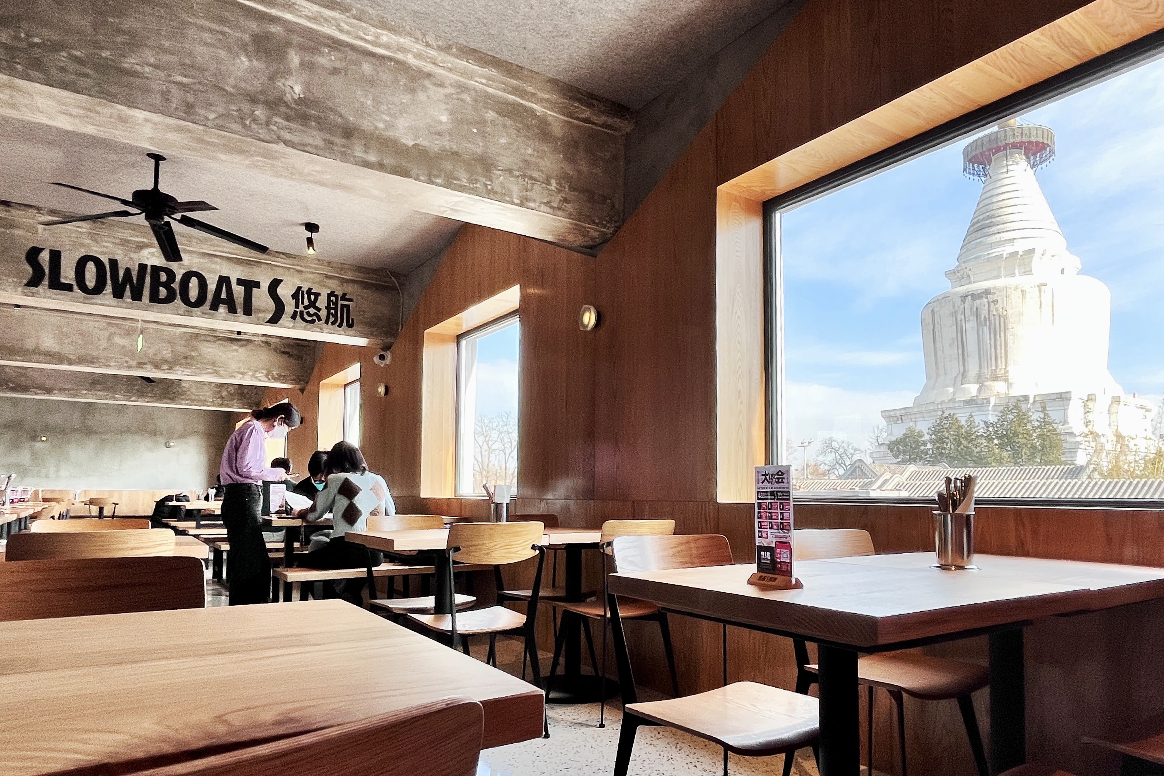

SLOWBOAT was founded in Beijing in 2011. Initially brewing in small breweries in the mountains around Beijing. From its humble beginnings in Changping, to the hutongs of Dongsi 8, Sanlitun, Dengshikou, and now Mai Zi. SLOWBOAT has always strived to be the best independent craft beer brand in Beijing, priding itself on offering the widest variety of small batch seasonal beers to the public and challenging the very definition of beer in China. 【REPLACE IT】

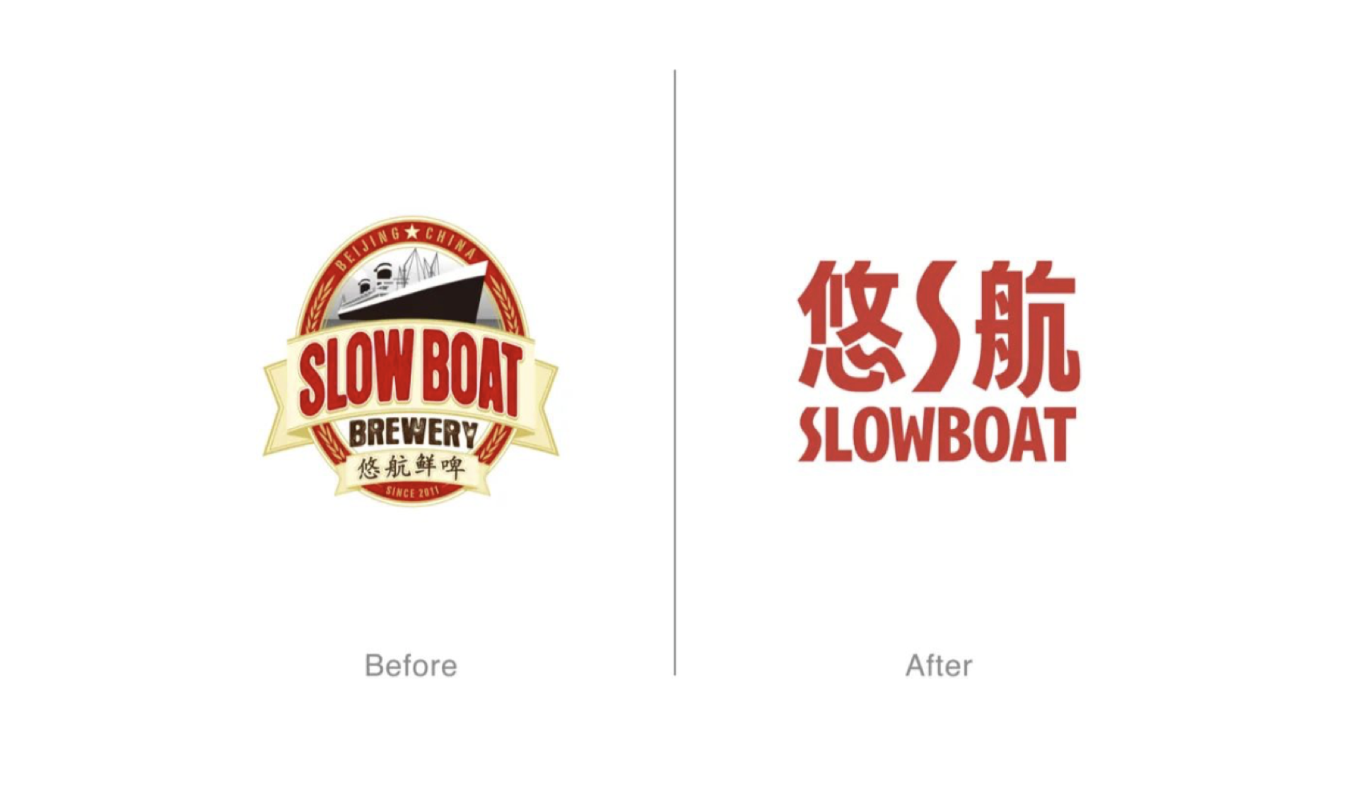
LOGO Design
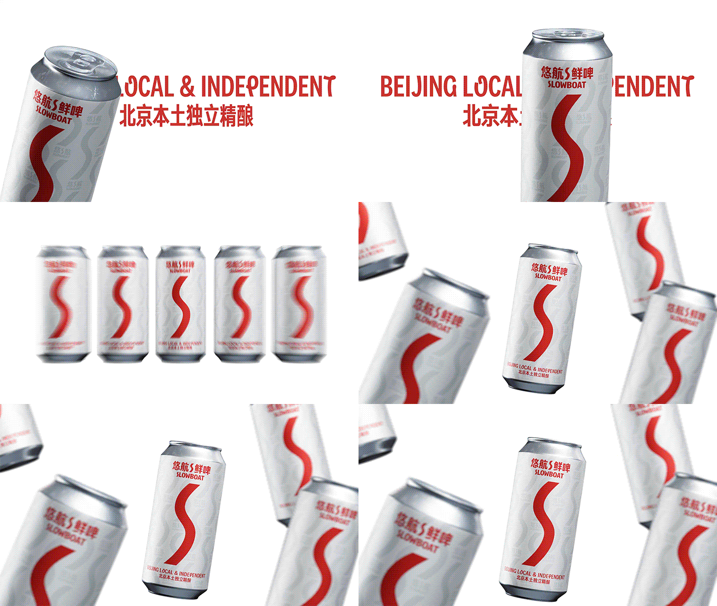
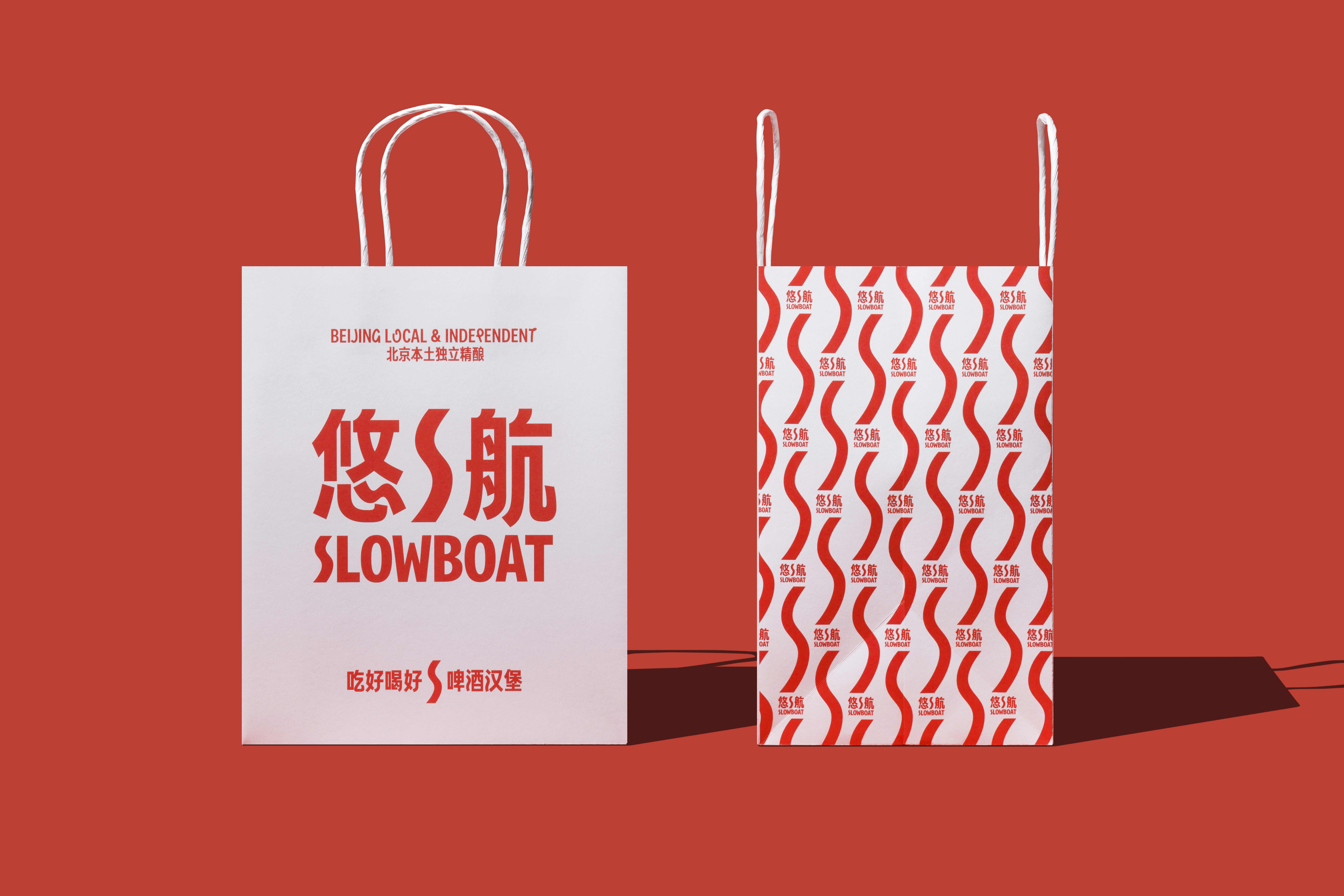
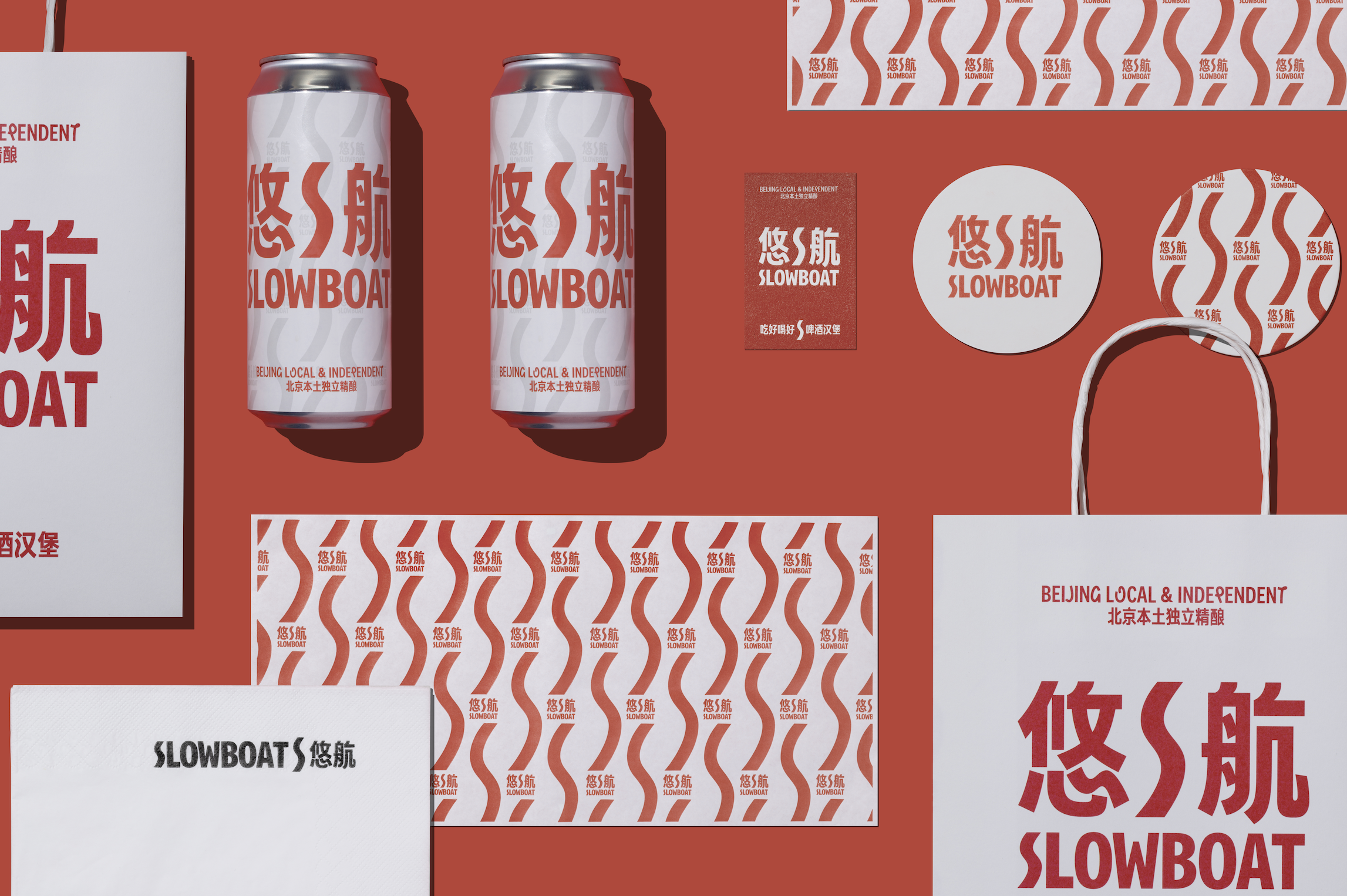
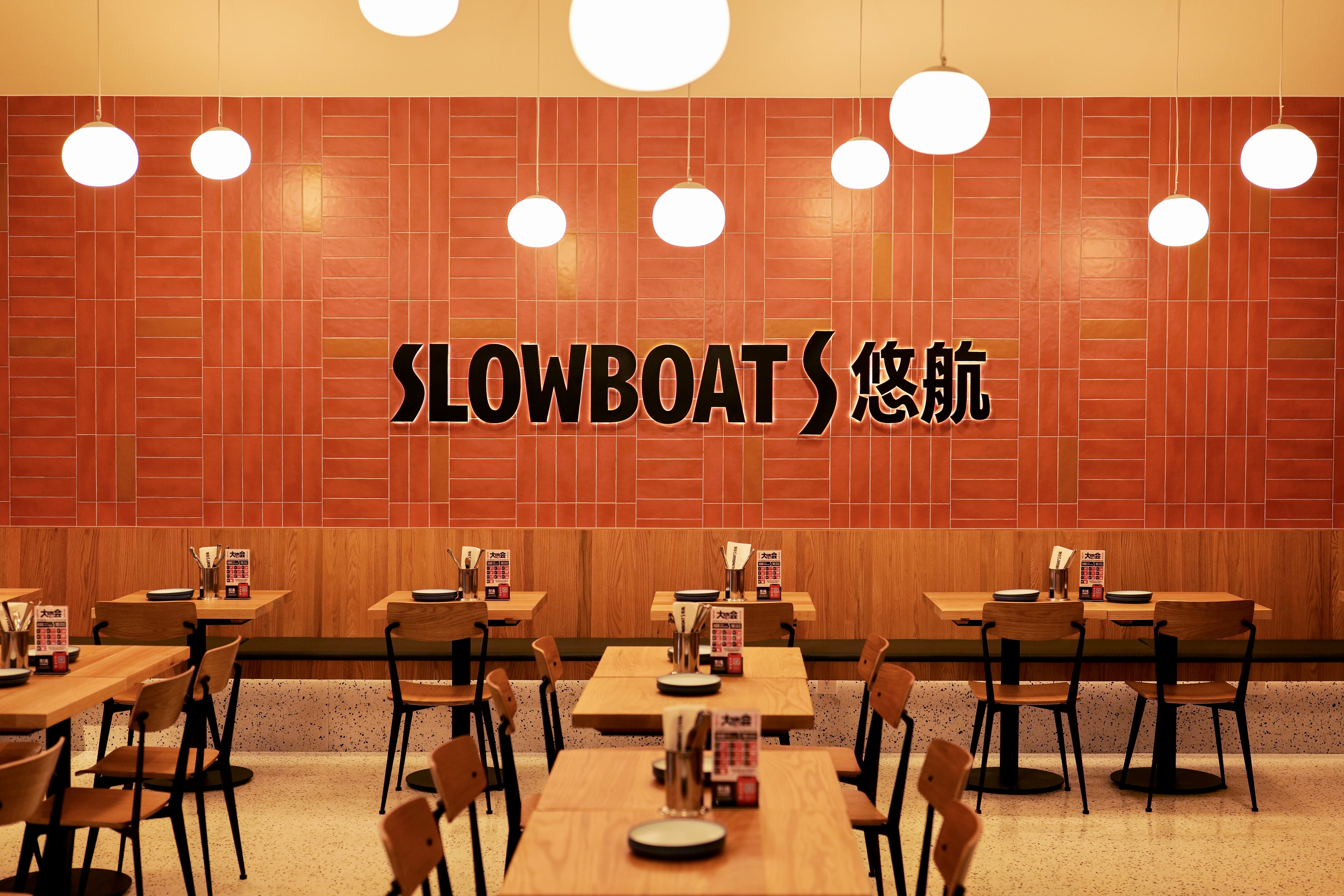
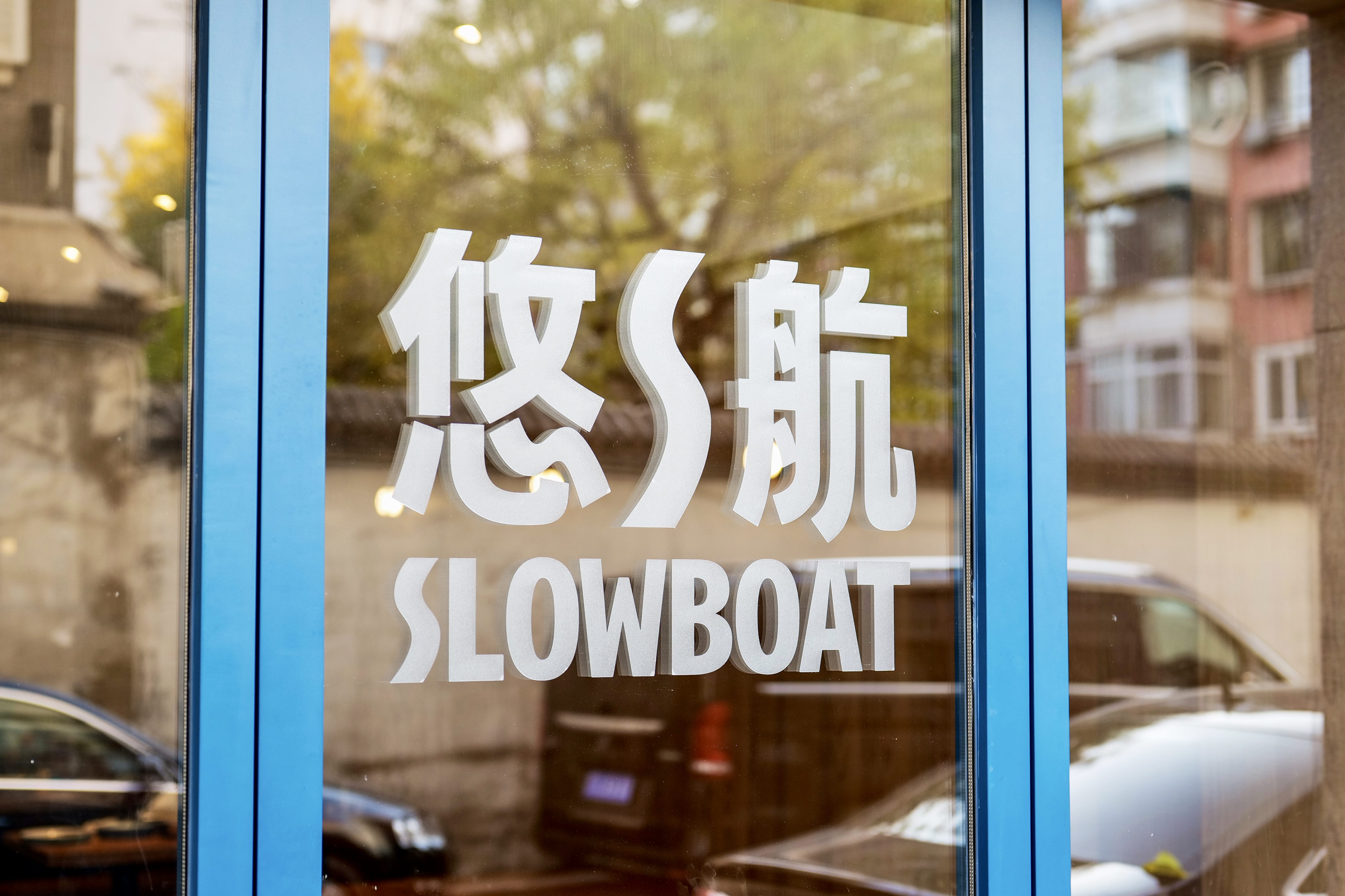
It conveys a sense of pleasure. It feels similar to the state of having a beer, and how we feel when more friends, family, loved ones, and new acquaintances meet and get together for a meal. The overall logo is strong and powerful. The logo is mainly in Chinese, and in addition to "SLOWBOAT BREWERY", a version of the word "SLOWBOAT" is also included. SLOWBOAT starts with fresh beer, but it is more than fresh beer. 【REPLACE IT】


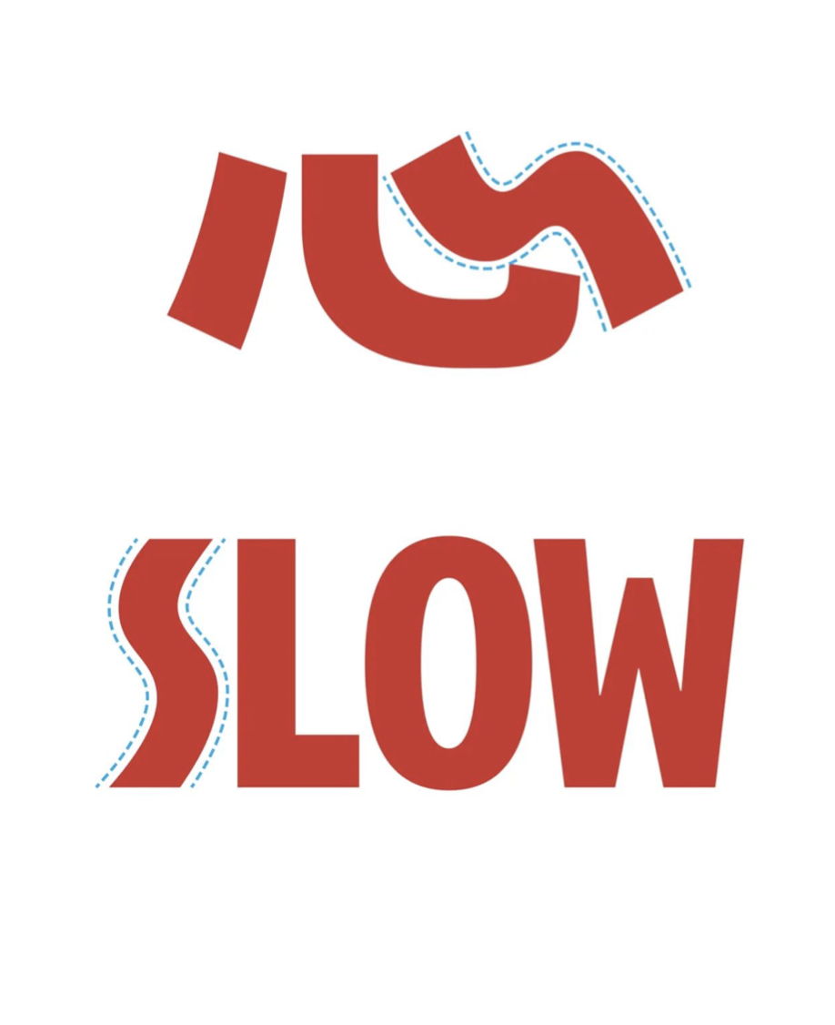

The logo has a solid base structure with smooth and sleek details, which represents EasyJet's dedication to the quality of its products and services, as well as its focus on delivering a pleasurable experience to its guests.【REPLACE IT】


Rebranding
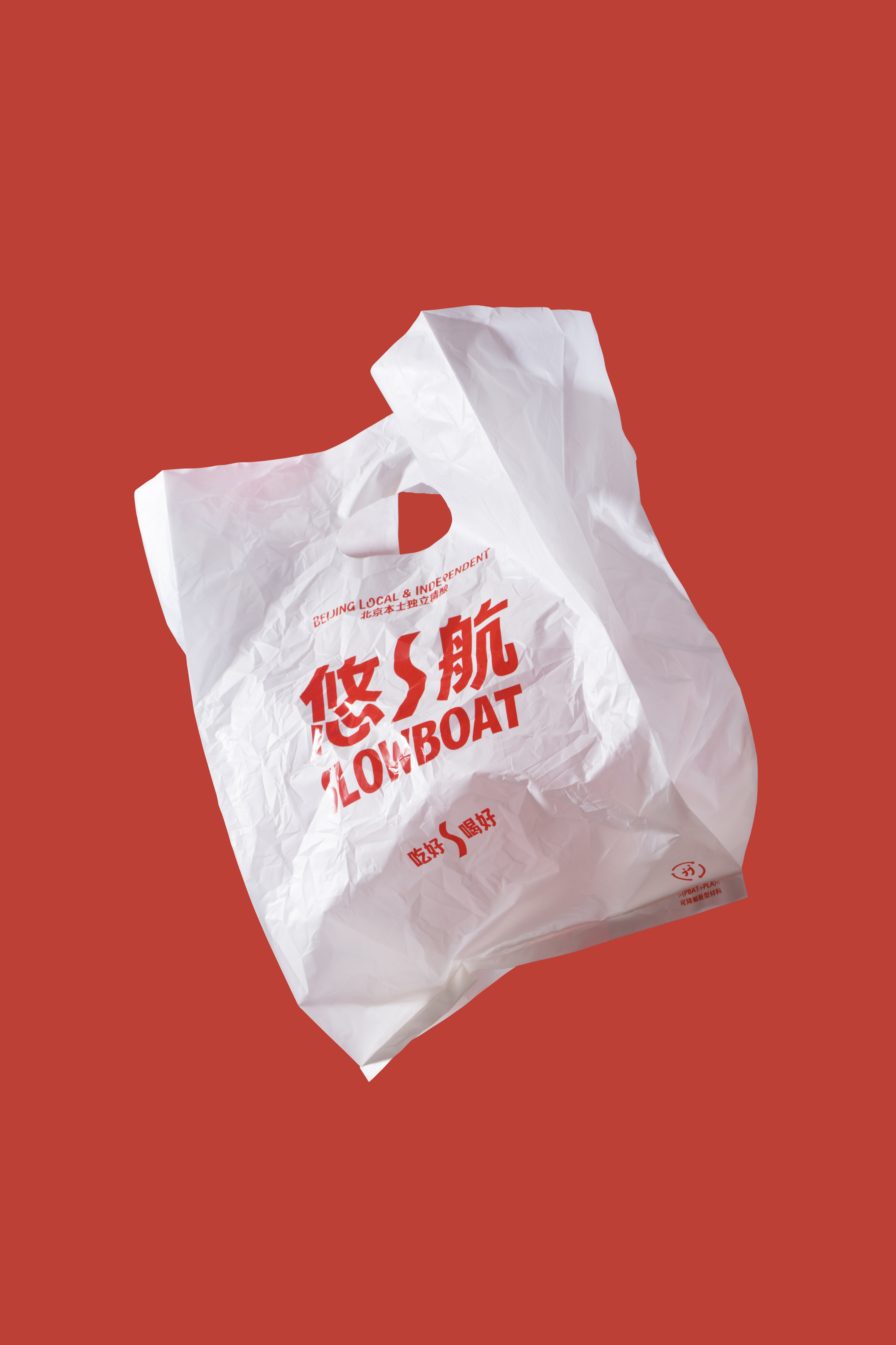
With a firm and stable base structure and smooth and sleek details, this represents SLOWBOAT dedication to product and service quality, as well as SLOWBOAT's focus on bringing a pleasurable experience to its guests.As a well-known brand in China's craft brewing community, SLOWBOAT has been developing for over a decade, and in addition to its consistently high-quality products and services, SLOWBOAT also hopes to provide the public with a more "SLOWBOAT" lifestyle through this Rebranding. Therefore, in the establishment of the new brand image, we centered on the concept of "Easy Flow", through the flow, full of vitality, rhythmic visual elements and processing, to create a free, lazy, full of hope "Easy Air" image.【REPLACE IT】

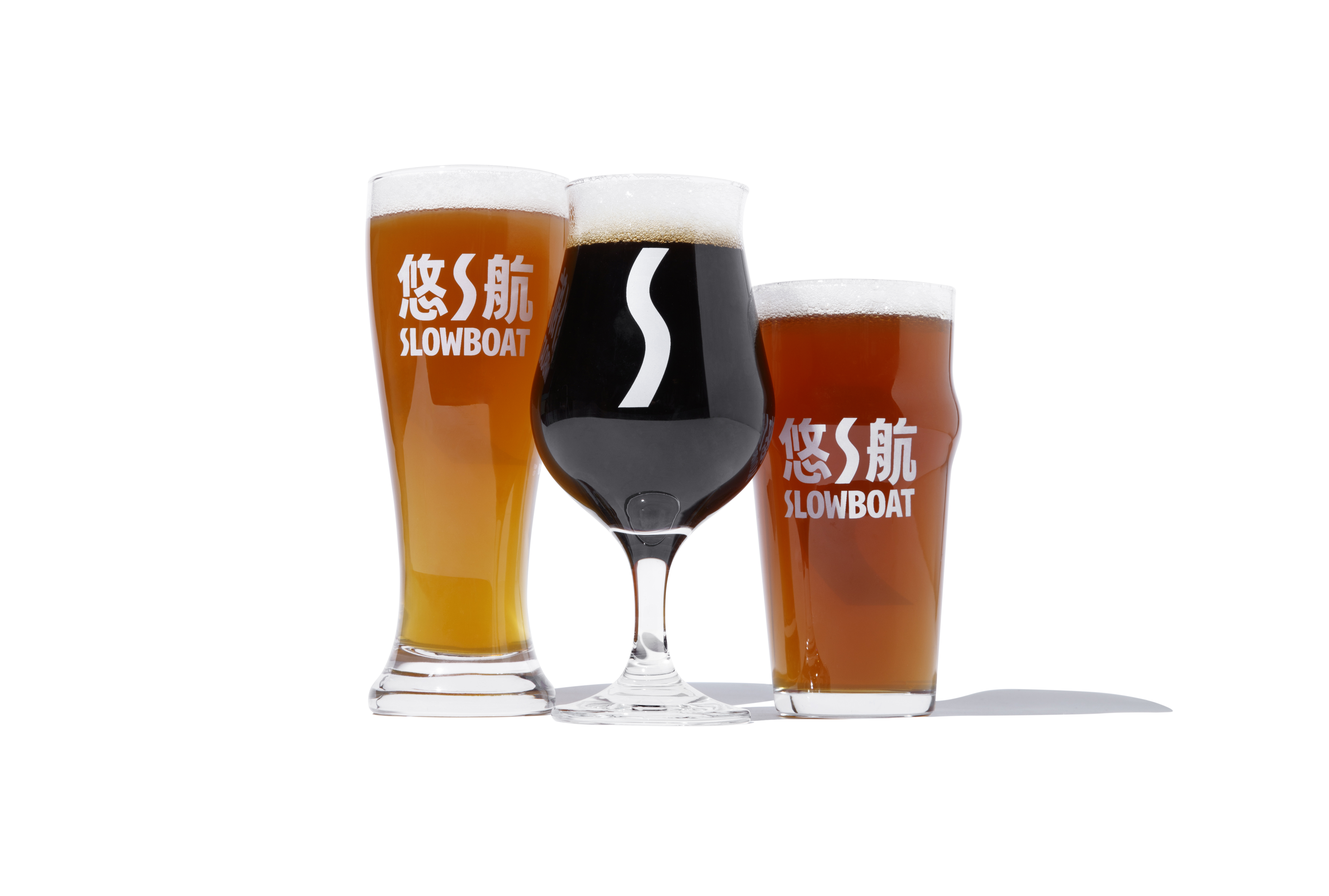
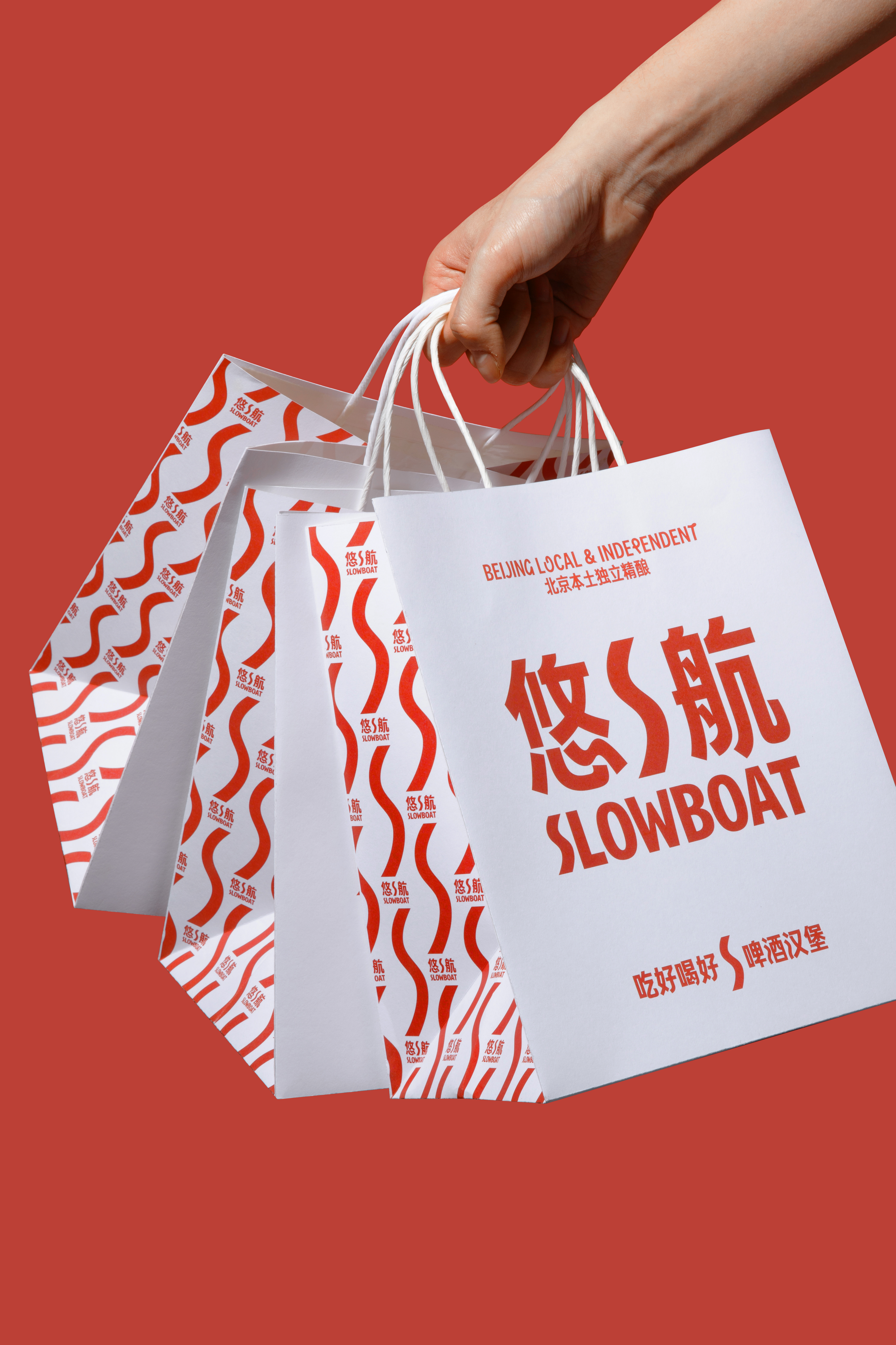


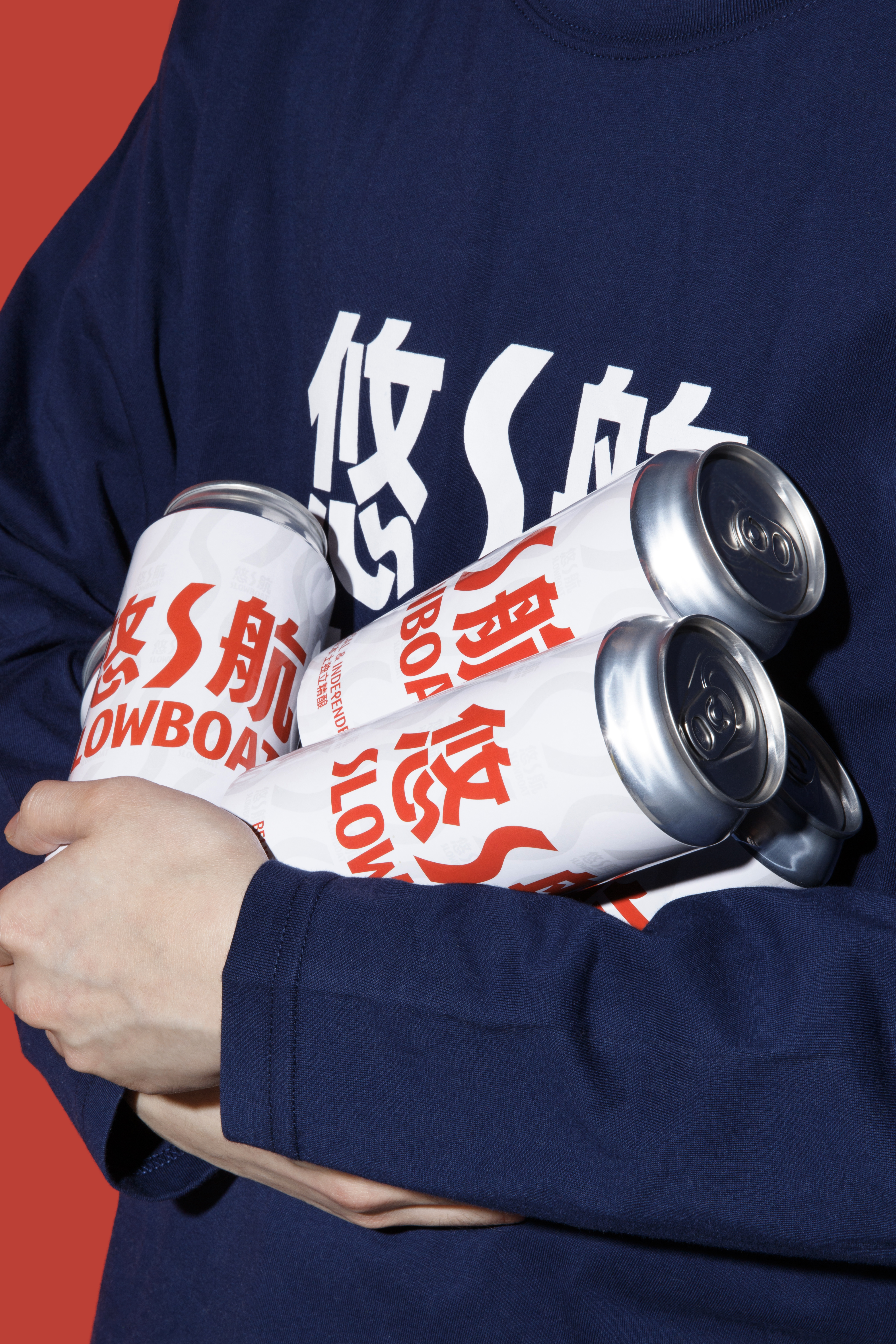
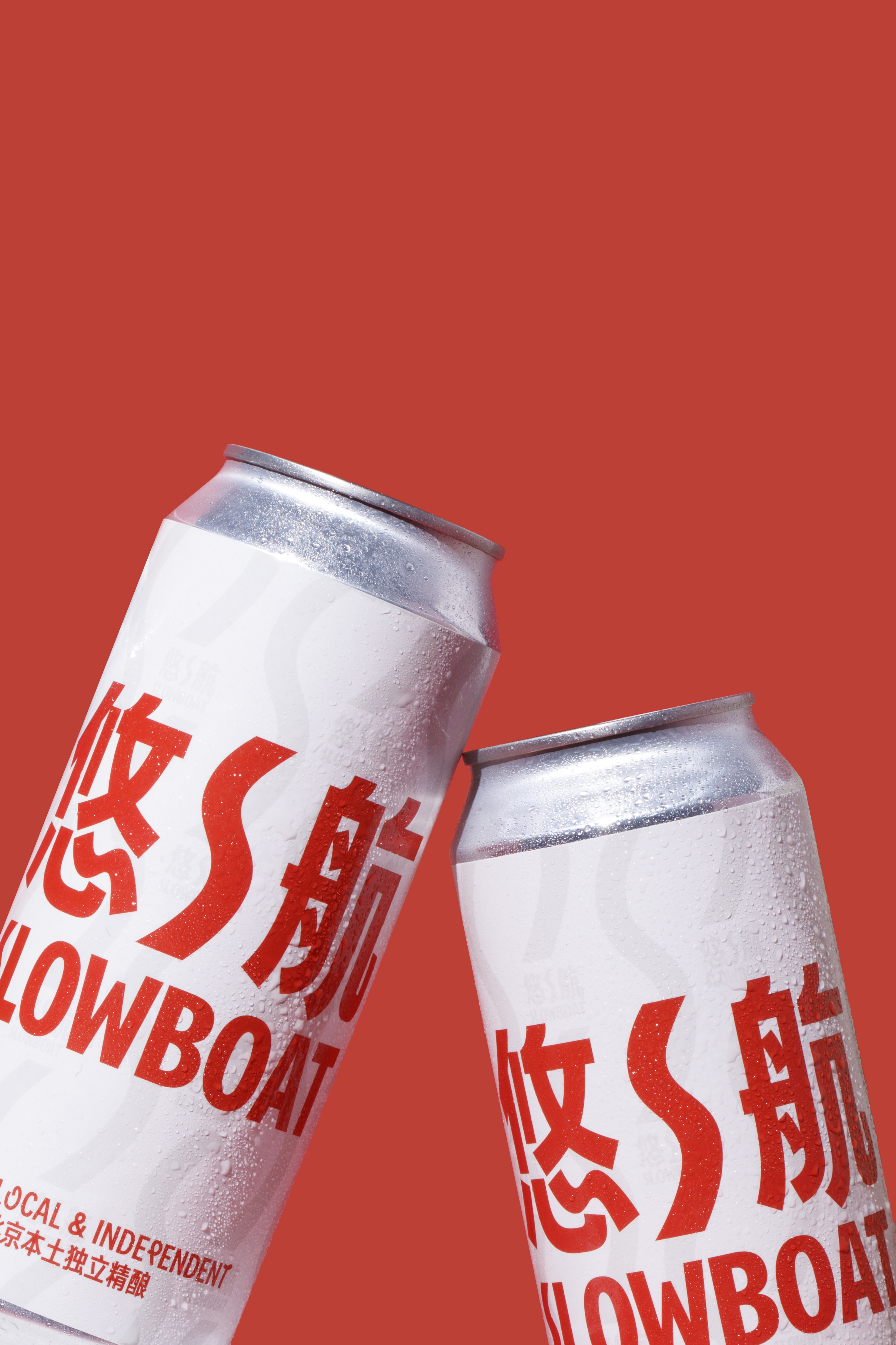


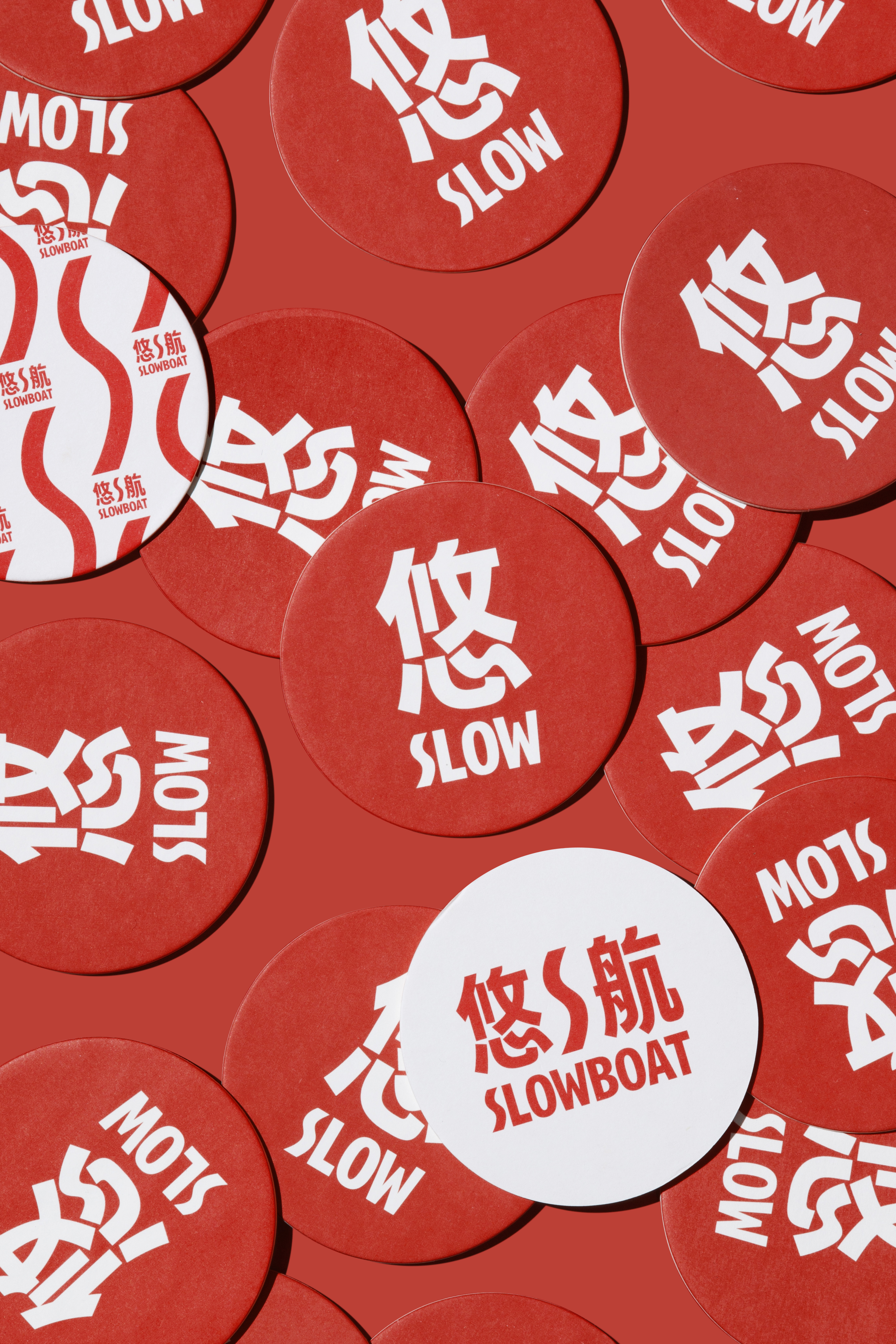
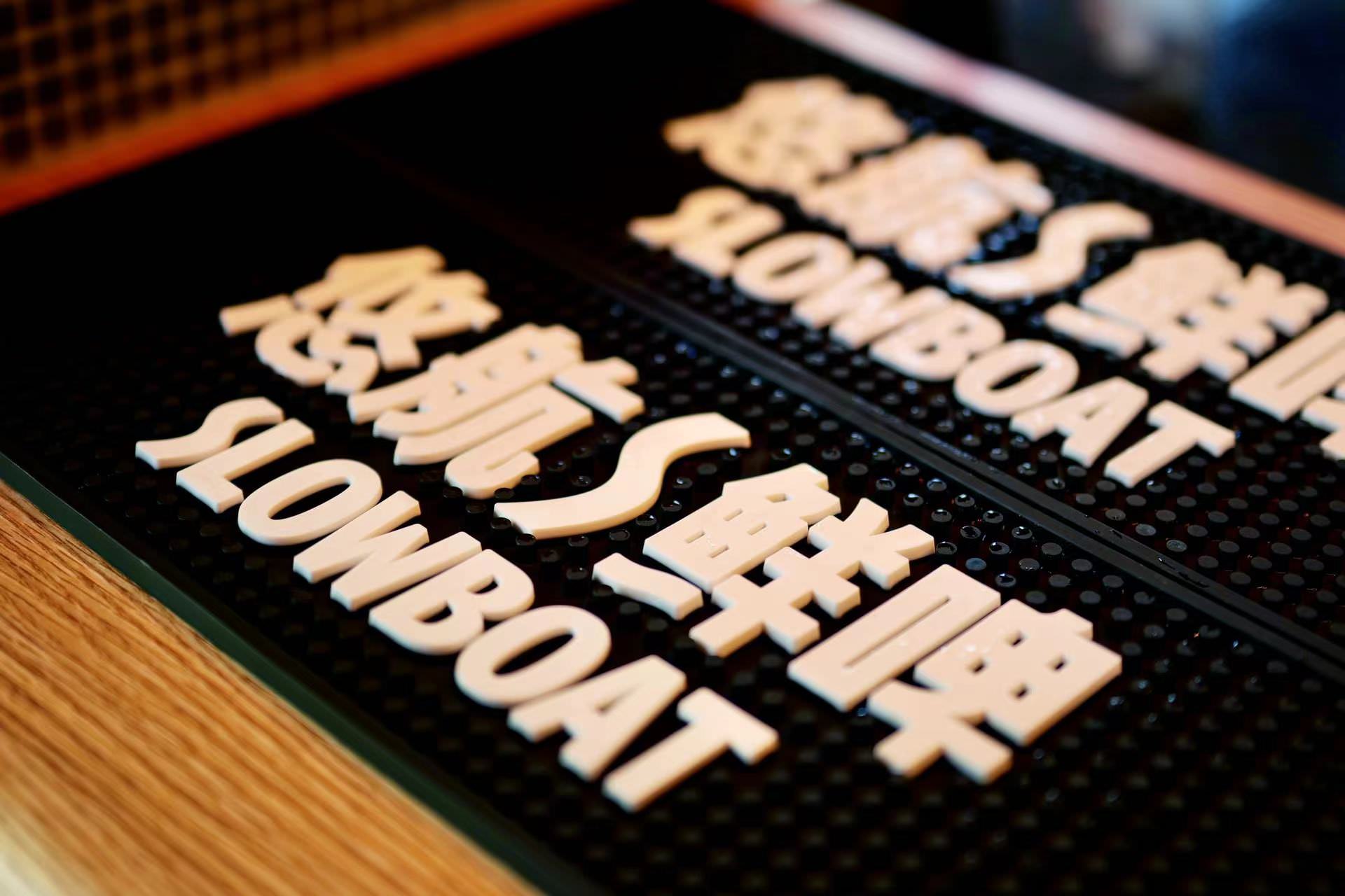
The letter "S" in the logo contrasts and blends with the other letters of the alphabet, which led to the concept of the Slowboat Display typeface, applying this language of fusion to every detail of the brand to achieve overall visual unity. 【REPLACE IT】
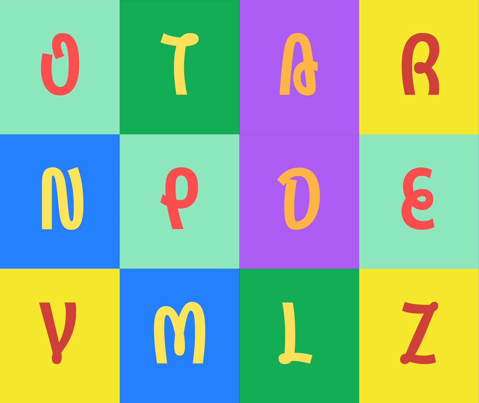

The brand image is in line with the current trend of brand culture and consumer culture and visual absorption habits, simple and open, is an open to be able to substitute for the thematic interpretation of the visual platform. 【REPLACE IT】

